I just published the biggest update to NLLStats.com since I created it in 2022. The colours are all different, it’s got dark mode, the page headers, table headers, and tab lists are always visible, and there are a bunch of other new fancy features. I’m pretty proud of this update, though it wasn’t entirely my idea, and I didn’t do most of the work.
The first time I got paid for writing software was the summer of 1988 at my first co-op job at IBM. That means I’ve been doing this for almost forty years, and I’m pretty good at it. What I’m not good at is user interface design. I can pick colours for things and it’ll probably look OK, but no better than OK. For example: the original nllstats.com.
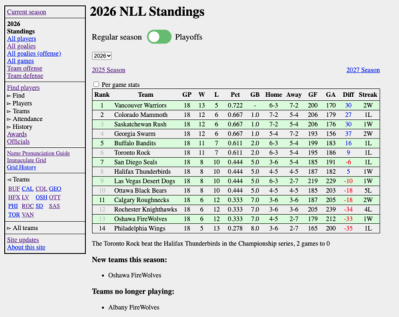
Old and busted
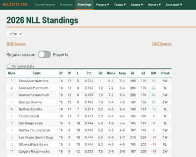
New hotness
When I created the site, I tried to make it look not terrible and figured I’d pretty it up later, but later never happened and it ended up on the back burner. After a while I realized that in order to make the site look better, I’d need a web designer. But I make zero income from nllstats.com; in fact I have to pay for the hosting so technically I run it at a loss. It’s not much but the point is I can’t hire (and therefore pay) a web designer. I asked on social media (a couple of times) to see if there’s a web designer out there willing to give me a few hours of their time and experience pro bono. I got no takers, so the redesign of NLLStats.com remained on the back burner, where it’s been languishing for years.
Then just a month ago, Halifax Thunderbirds and NLLStats fan Rob Josey reached out asking if I’d considered a redesign and if I’d thought of using AI to do it. The answers are “yes, countless times” and “uh… no”. The fact that I’d never considered AI for this is a bit strange since I use AI all the time at my day job and I’ve used it a couple of times on nllstats.com to examine the code and find inefficiencies and optimizations to make things faster.
Rob actually made the initial request for me, asking an AI “recreate this website so that it actually looks good”, and sent me the result. I gotta say, the result was damned impressive. I didn’t end up using that design but I did incorporate pieces of it. The first thing I noticed was that the menu was across the top and mostly hidden instead of down the side and mostly visible. I implemented much of that part myself and then smacked myself for not doing it sooner. Just that one change gives so much more screen real estate.
Next I threw AI at the code and said “Look at the code and make the site look more modern.” It gave me a new design, and then the tweaking began. After a few iterations, we had an app that looked brand new.
Then I went through the entire site, page by page, and made sure everything still worked and looked good and was generally clean. That wasn’t so bad but then I turned on the mobile app simulation mode and did the whole thing again. That was a mess. There were pieces that had been broken that I hadn’t noticed. We had tables with five column headers and four columns of data, or vice versa. We had different pieces that overlapped on a small screen. And a lot of it was just messy and ugly. It’s a lot cleaner now.
I went to NHL.com and NBA.com and took a look at their stats pages for ideas. The main page for both was a stats summary page, listing the top 5 or top 10 players in each of a bunch of categories, so I added that. I will probably make that the main page eventually. The sidebar on the games page comparing the team totals in a few stats came from Rob Josey’s design.
After the AI redesigned things, I asked it to add about four different colour palettes and an easy way to switch among them, and implement dark mode as well. Then I had my wife and sons look at the different colours and pick one. They also looked over some other pages and gave suggestions – if you like the sticky table header in a list, thank my son Ryan.
As I’m writing this article, the new design is only a couple of weeks old and has not yet been published to the site. Only a handful of people in the world have seen it. And already, when I look at the live site (with the old design), I’m amazed at how ugly it is. I start thinking that I should have done this three years ago, but AI wasn’t nearly as good then as it is now. I’d have had to do it myself, and I wouldn’t have done nearly as good a job. Big thanks to Rob for the idea and for getting me started down that road.

